Interest survey - 'remade/refreshed' enhanced skin

I'm not sure why couldn't the complaints just be solved
First no one wants to complain. You have worked hard and it looks good.
Second there is always someone to complain (I apparently am one, I like to think of it as constructive)
Third well with a 1000 opinions it will never be perfect..
Forth ... ok there is no 4th. I dont like this numbering stuff..


Admin = Tech person. If someone said Apache you think of a Web Server
User = Your non tech oriented spouse or mother. If someone said Apache you think of a Cowboy movie with John Wayne

I think in general you have 2 Major sides of the Process.. The Admin side and the User side.
Admins like easy, fast, distraction free and simple.
Users like easy, fast, distraction free and simple with Icons

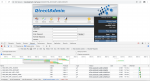
Seems like admins tend to like text and logical groupings
Email
DNS
Users
HTTP
FILES

User like things they think of and it's not like the admin side.
They want it Logical and simple
Email Icon
Web Icon
File Manage Icon
A big flashy sign saying do this it will make the system work for you..

Not sure this helps. I personally dont like the standard enhanced it looks Old..
 
I'm not sure why couldn't the complaints just be solved, instead of re-creating something else? :)

I think people all have their own mini-frameworks in mind that they are comfortable with, so people use what they know. Picking up someone's code and working with often feels more difficult. I myself would probably do a re-write than a fix, even though it is more work. I chalk that up to lack of experience on my part.

Maybe I have missed other discussions on the topic, but how does licensing fit in to this? Are there parts of DA, like the UI or other elements, that are officially open sourced?
 
......... the one thing i miss most is the classic 'Enhanced' theme workflow - with all the animations it takes me much longer to set up a domain and be on my way. That's why i decided to start a little project to make the enhanced theme to look a little more modern, while not losing any of the functionality. I'd love to know what you guys think of it - if there is enough interest i can continue to develop this and release it for free to the community, as a sort of side project (this way i'll also have something to do for fun in the evenings ;-))

Please let me know any suggestions - this is just the UI design currently - and i can change anything easily. Again, if there is enough interest, i'd be happy to code this and give it out for free to the community, and keep it up to date ofcourse ;)

Thank you for your time and reading this - and god bless DirectAdmin!:cool:

Awesome I was actually planing to do this but I had to give up atn since I can't make the time to fully figure out node.
MIght it be an idea to throw it it on Github so we all can help ?
 
Any updates on the enhanced v2 ? :) Would like to contribute as well. The new evolution is just not for me as admin. It is slower and things are too much stretched. Now the enhanced theme doesnt come with latest build as well.
 
Any updates on the enhanced v2 ? :) Would like to contribute as well. The new evolution is just not for me as admin. It is slower and things are too much stretched. Now the enhanced theme doesnt come with latest build as well.
You need to make request in Feedback if you want a version 2 of enhanced.

Evo is fast for me. Especially when you disable route transitions. Other than enhanced looking old. Not being full screen is the worst part of enhanced.

You mean it’s not set as default. You can go in reseller level and set enhanced for yourself as always.
 
It is slower and things are too much stretched. Now the enhanced theme doesnt come with latest build as well.
If I'm correct the animation is causing the slowness and could be fixed by using the "disable transitions" option. Not sure about this.

My admin and me agree that for admins and resellers the Enhanced skin works a lot faster and has a better overview with the text links.
However, as I was informed, the Enhanced skin is not that dynamic as the Evolution skin. So creating the same options will take some more time.
So if you want to create a feature request to update enhanced skin, I will certainly upvote it, maybe others too.
 
Any updates on the enhanced v2 ? :) Would like to contribute as well. The new evolution is just not for me as admin. It is slower and things are too much stretched.

Would something change if we call Evolution the Enhanced v2 skin? I guess no, so, I'm not sure why people tend to think Enhanced v2 would be something they're looking for. And I'm also not sure why suggestions cannot be implemented into Evolution skin? I'd like to note no one has ever provided a proof that enhanced is faster on navigation (not the cold boot), and it's not so hard to do. May you attach a proof that it's slower? Then we'd have something to "fix" :)

If I'm correct the animation is causing the slowness
Which animation? "Disable transition" is just about indicator on page load. We've discussed it many times in the past - enhanced has the transitions, it's that white flash when you click on any URL :) And there is no way to disable it at all, because it's a browser refresh transition.

Enhanced skin works a lot faster
May you attach a proof? We'd have something to fix then :)

has a better overview with the text links
Did you try all the layout options? Standard expanded has all the URLs listed. I personally never use any URLs at all, I always use the global search. You just enter anything you need - for example "users" - and you immediately get the URL shown. If standard expanded isn't what you're looking for, and all the other (4) layout options do not work as well, - maybe you have an idea of what navigation type are you looking for?

Thank you for the feedback! :)
 
I'd like to note no one has ever provided a proof that enhanced is faster on navigation (not the cold boot), and it's not so hard to do.
Evo is just slower, it's even visible on our pc, it's just as if there is some kind of animation. In another thread this was discussed too by the way.
The kind of animation, kind of smoothness is just visible, When using Enhanced skin it's bam and it's there. No smoothness, loads faster.
You discussed it with others.
White flash? Maybe, if I change an option in my reseller skin, it shortly gives me totally white on the options for half a second, and then then selected options become visible.
If I do the same on Enhanced skin there is no half a second delay. The options are instantly there.
If you need proof I will create a small film for you, it's clearly visible. I'll post it here after creation.

Did you try all the layout options? Standard expanded has all the URLs listed.
Yes and we don't like the overview of it, so we tried the icon grid, which was more nice, but too cPanel alike, which we don't like either. Sorry.
I don't know about others. But the type of navigation we're looking for is what the Enhanced skin is already giving us and looks like. We just love that skin even if it might look a bit old fashioned, it's very easy to work with. :)
So we don't really need a v2. The current version is fine, just need all options in it.

Reading your reply and the previous reply that implementing new options (like mail only packages) takes more time, gives me the impression that DA is looking to push the Enhanced skin out of service and only use Evo. Is that correct?

Edit: I'll pm you the link to the movie when ready, don't want everything just public present.
 
------with EVO I must to do more steps:------
Evo mail:
31-05-2020 18-48-10.jpg
----------------------------------------------------------------------
Enhanced mail:
31-05-2020 18-49-34.jpg
----------------------------------------------------------------------
Evo php/private selector:
31-05-2020 18-52-27.jpg
----------------------------------------------------------------------
Enhanced php/private selector:
31-05-2020 18-50-47.jpg
and another same menu items

------hard to read white text on blue background:------
Evo:
31-05-2020 18-53-34.jpg
----------------------------------------------------------------------
Enhanced:
31-05-2020 18-54-50.jpg

------compact - fast navigation------
Evo:
31-05-2020 19-02-14.jpg
----------------------------------------------------------------------
Enhanced:
31-05-2020 18-57-50.jpg
evo takes more screen space, makes the mouse move more

------when I try to compact window to open 2-3 tabs at one screen----
Evo:
31-05-2020 19-08-14.jpg
----------------------------------------------------------------------
Enhanced:
31-05-2020 19-10-22.jpg
 
Indeed also more steps.

I just send you via pm a link to the movie I made in which the delay between options is also clearly visible.
 
Regarding the slowness - what I'm looking for - screenshots of network tab, showing slowness of Evolution. I'm attaching "Add New User" example of Evo vs. Enhanced. 0.7s vs. 1.8s

5.5kB vs 133kB (24x less of data to transfer using Evolution theme), 3 vs 28 requests (9.3x less requests using Evolution).
 

Attachments

  • Screenshot 2020-05-31 at 20.18.14.png
    Screenshot 2020-05-31 at 20.18.14.png
    762.5 KB · Views: 6
  • Screenshot 2020-05-31 at 20.17.13.png
    Screenshot 2020-05-31 at 20.17.13.png
    306.6 KB · Views: 6
----------------------------------------------------------------------
Evo php/private selector:
Enhanced php/private selector:

It's also available in the widget. But I see 2 conflicting points: "move mouse less/compact" and "too many steps". So, what's better - have as many elements on one page and try finding needed ones using the mouse, or clicking twice and not needing to navigate there?

------hard to read white text on blue background:------
It's customizable :) Did you try the global search mentioned above? Enhanced is missing it at all. If there is a need for a new layout option - I'd suggest creating some 'sketch' and posting it to feedback.directadmin.com, we're really not against it. The issue is - we have 4 layouts already, and.. for example, if you choose icons grid - you have all URLs in one place, and on white background. So, I'm not sure if we need a 5th layout option, or to change the standard, or to apply changes to the icons grid which has the black text on white background? Global search also has white background and dark text on it..
 
So, what's better - have as many elements on one page and try finding needed ones using the mouse,
I like it more like in enhanced. Just a great over view with for example 3 main categories.
The thing I'm also missing is that on Evo if I click on a categorie, there is no complete overview (like with enhanced), I have to click on the option I need.

I created the network screens as you requested. If I read them correctly, the Evo looks faster in ms, but if you look at the movie I made, you see it doesn't look that way. On every screen loaded there is a smal delay which is not present on Evo.
directadmin-evo.jpgdirectadmin-enhanced.jpg
 
I created the network screens as you requested. If I read them correctly, the Evo looks faster in ms, but if you look at the movie I made, you see it doesn't look that way. On every screen loaded there is a smal delay which is not present on Evo.
View attachment 3377View attachment 3378

I checked it, and backups definitely looked faster in Evolution :) I'd suggest making 2 short videos just of this single page (backups), start them next to each other from your click time, then click play and check which one starts to show the final view sooner, I bet it's Evolution. If not - it needs to be fixed.
 
Lets say for arguments sake it's evolution. As to the ms presented in the screenshots it might indeed be, in milliseconds. But still.
a.) there is that animation in Evo which does make it look slower. It's not loading tight even if it is faster.
b.) We still like enhanced better and the overview of enhanced. 1 overview of a lot of things on 1 page.
 
"makes it look slower" and "is slower" are two different things. Page transitions are also used in enhanced, they're just native to your browser (example:
, enable/disabling is also optional:
). And it's different between the browser: https://9to5google.com/2019/01/18/google-chrome-fix-white-flash/. There is a way to disable them in Evolution, but there is no way to do this in Enhanced (unless your browsers lets you do it) :)

b.) We still like enhanced better and the overview of enhanced. 1 overview of a lot of things on 1 page.

I think it doesn't fit well with "takes more screen space, makes the mouse move more" from @Zhenyapan, does it? So, I'm not sure which direction to go.

Also - Enhanced is still there, if that's the most favorite theme, it's packed together with DirectAdmin. Evolution is responsive (mobile-friendly), while Enhanced isn't, so, more things shown on a single page might cause facebook-like infinite scrolling feel on mobiles/tablets, wouldn't it? :) And as I said, it hardly fits with "takes more screen space, makes the mouse move more" statement, as more elements = more mouse movements.

I'm just trying to understand what's the main need there.. as there are some conflicting statements.
 
I think it doesn't fit well with "takes more screen space, makes the mouse move more" from @Zhenyapan, does it? So, I'm not sure which direction to go.
I don't mind the more screen space. I'm only talking about the category overview with all the options, so you can change faster to what you want.

As for the flickering, it's no flickering. It's fading I'm talking about. And that also is happening with Chrome, I just tested it.
Enhanced does not do fading, or at least doens't look that way. In Evo it's very clearly visible.

I'm just trying to understand what's the main need there.. as there are some conflicting statements.
Which is very much appreciated, hence the effort I took in making movie and screenshots.

As for my part:
1.) The most important need is that new things which appear in Evo, also get made for Enhanced skin.
2.) Evo would also be fine, if it would have an Enhanced like overview, which the current layouts do not have. But I don't know if that's even possible in Evo. And if the fading could be disabled.
3.) Evo is more modern and nice for the customer.

Concluding:
a.) If Enhanced is going to stay then 1 would be great. But you told that would take more time. In those cases kind of an ETA would be nice.
b.) Evo is in fact modern and nice, so if 2 would be possible, we might even switch to Evo, also due to 3.

P.s. we do have customers on Evo with grid nowaydays. ;)
 
The thing is we all like different things and features. So making everyone happy is not possible. I personally like Evo way better, but I didn't spend 10+ years using Enhanced. I think if enhanced was responsive, had themes, and all of these old cartoon looking icons were replaced it might be ok. To me that is Evo. The thing will say is I think Admins want simplicity and workflow as fast as possible. I think that is what Zhenyapan is really trying to say. I think Users of today would prefer Evo. I think admins prefer enhanced because its workflow is fewer steps and simpler. A lot of admins don't like GUI, to begin with so simple straight forward enhanced seems to fit more. Either way seems like you all should keep both.

The only thing I don't like on either one is the categorization of tasks. I haven't done it yet but I would rather see more logical groupings. DNS, Mail, Web server, Security, and Users etc..in the Admin screens. However real system features trumps that. As you all know I would prefer someone really focus on documentation of the entire system than anything but hey that just me. Again just my opinion and thoughts.
 
Back
Top