A little feedback on the new file manager UI

k1l0b1t

Verified User
Joined
May 10, 2020
Messages
525
Location
Belgium
First of all, hapy new year y'all

I've got a little piece of feedback on the new file manager, the file listing is a bit confusing:
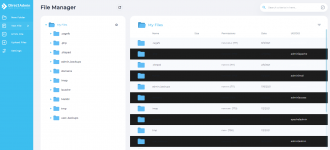
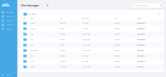
It looks like not all files are listed, because of the little "bubble" the listing is in. In my screnshot it looks like "Maildir" is the last folder in the home directory, when in fact you can still scroll. perhaps make it extend to the bottom of the screen instead (so it's more obvious), or, make the scrollbar allways visible.

This would greatly increase my experience with the filemanager.
 

Attachments

  • Screenshot 2022-01-01 at 09-49-52 webserver lamdev be DirectAdmin 1 63 4.png
    Screenshot 2022-01-01 at 09-49-52 webserver lamdev be DirectAdmin 1 63 4.png
    78.5 KB · Views: 431
I recommend also to have a more compact view of the folders/files and details. Those file/dir icons look huge.
 
Ah, I just upgraded my DirectAdmin to the latest version, and boom! The File Manager has now defaulted to this unpleasant User Interface. I am looking for a way to roll back my previous UI.

1641115838392.png
 
Same here; I'd like the possibility to revert to the previous layout (the one pmjcreations posted). I'm using 'sidebar' for a reason.. don't like the 'refreshed' theme.
 
I was under the impression that this user interface for the File Manager only appears when we select the refreshed layout.

I still use the Icons Grid, and only my File Manager UI is changed.

I am using Windows 11, and when the dark mode is enabled, the alternative table colors note is optimized for the dark mode.

See, this is Dark

1641117803093.png


See, this is Light

1641117835915.png
 
How can I return to the previous look of the file manager? After the current update I have to force a light theme ...
 
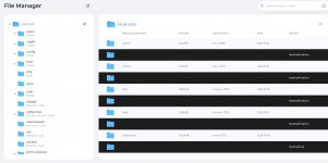
I updated DirectAdmin today and when use file explorer i have problem witch using dark theme.
Someone know revert file explorer or Direct Admin version? Or another solution to the problem?

(Problem it happens only use dark theme).
 

Attachments

  • Captura de tela 2022-01-04 150945.png
    Captura de tela 2022-01-04 150945.png
    98.3 KB · Views: 141
I updated DirectAdmin today and when use file explorer i have problem witch using dark theme.
Someone know revert file explorer or Direct Admin version? Or another solution to the problem?

(Problem it happens only use dark theme).
I wrote to support and received information that the problem is known and they are solving it.
 
I would also like to roll back the previous version of File Manager. This version doesn't match my theme.
 
It affects dark mode only and it's been fixed in alpha build, to update:
Code:
/usr/local/directadmin/scripts/getDA.sh alpha

Thank you for the report!
 
It affects dark mode only and it's been fixed in alpha build, to update:
Code:
/usr/local/directadmin/scripts/getDA.sh alpha

Thank you for the report!
there is still a problem
 

Attachments

  • Zrzut ekranu 2022-01-05 230717.jpg
    Zrzut ekranu 2022-01-05 230717.jpg
    125.5 KB · Views: 128
Is there a way to get the menu back to the top?
Having the menu on the left side means there is not enough space for the files on my screen.
Which is the part that this is all about I would think. No I cannot use a higher screen resolution.
The file manager as it is is completely broken from my POV.

Oh and settings menu doesn't work either.
Choosing left bar style just flashes.. got option Full and .. nothing else.
 
Adding some feedback here too:

Thanks for revamping the file manager, it was a nice surprise.. however, this recent update (personally I feel) looks terrible. Seem to have issues with changing any colours and also the logo is cut off.. which is really annoying. The "minimized" menu simply shows a white circle, but if I right-click and say "open image in new tab", it will show the correct logo.

Those overly-rounded edges feel a bit "2000s" to me, reminds me a bit of Windows Media Player skins from Windows XP.

On top of that, when you drag files, there are NO visual indicators that you have grabbed them, only when moved them over the top of another folder does it say "Move Files...." There really needs to be some sort of proper indication that you have picked up the files you are trying to move, before you drop them onto a folder.

I also feel that the size of the rows are over-exaggerated.
 
This new buggy file manager is default for all skins. It should be roll back. There is no complete information.

Why do DA not provide demo of using this file manager ? Do they know how to use this ?
Seems DA guys also have forgot to use this.
 
This new buggy file manager is default for all skins. It should be roll back. There is no complete information.

Why do DA not provide demo of using this file manager ? Do they know how to use this ?
Seems DA guys also have forgot to use this.

Yes, a filemanager rollback is ideal.
 
File Manager is built into the DirectAdmin binary, and it is not possible to roll back or switch it alone. We can only roll back the entire DA and not just the FM. So, I don't wish to do that.

I don't like this new File Manager, and I wish someone from the DA team would take this thread as user feedback and provide a resolution.

@bdacus01 already tagged two staff here, so I will not poke them again.
 
Back
Top